stough 202-
DIP 4 - 4.7
Tutorial from Better Explained
3Blue1Brown video on the Fourier transform, or the decomposition of a signal into a collection of pure frequencies.
Reducible video on the Fast Fourier Transform, which we’re using here.
See scipy’s intro as well.
When we looked at block transforms for compression (see view_basis_blocks), we saw how an image block could be decomposed into a combination of basic patterns. One of those pattern sets was the Discrete Cosine Transform. This happens to be very closely related to the frequency analysis we’re covering here.
The Discrete Fourier Transform of the length- sequence and its inverse are defined:
These equations show basically that any sequence can be written as the sum of complex sinusoids. We will use the 2D extensions of this process.
Imports
We’ll import scipy’s fft2 and ifft2 functions to help us out here.
%matplotlib inline
import matplotlib.pyplot as plt
from matplotlib.colors import LogNorm
from skimage.color import rgb2gray
import numpy as np

# For importing from alternative directory sources
import sys
sys.path.insert(0, '../dip_utils')

from matrix_utils import (arr_info,
                          make_linmap)
from vis_utils import (vis_rgb_cube,
                       vis_hists,
                       vis_pair)

from scipy.fft import fft2, ifft2, fftshift, ifftshift
from skimage.transform import resize
Frequencies in 2D
Before looking at real images, let’s build some intuition. In 2D, the “pure frequencies” that the Fourier transform decomposes an image into are sinusoidal stripe patterns. Each has a frequency (how many stripes fit across the image) and an orientation (which way the stripes run). Let’s make a few and look at the magnitude of their 2D FFT, shifted with fftshift so that zero frequency is in the center (more on that below).
n = 128
yy, xx = np.mgrid[0:n, 0:n] / n   # coordinates in [0, 1)

patterns = {
    '4 cycles, vertical stripes':   np.cos(2*np.pi*4*xx),
    '12 cycles, vertical stripes':  np.cos(2*np.pi*12*xx),
    '8 cycles, horizontal stripes': np.cos(2*np.pi*8*yy),
    'diagonal (6, 6)':              np.cos(2*np.pi*(6*xx + 6*yy)),
}
patterns['sum of all four'] = sum(patterns.values())

f, ax = plt.subplots(2, len(patterns), figsize=(11,4.5))
for k, (name, P) in enumerate(patterns.items()):
    ax[0,k].imshow(P, cmap='gray')
    ax[0,k].set_title(name, fontsize=8)
    ax[1,k].imshow(np.abs(fftshift(fft2(P))), cmap='gray',
                   extent=[-n//2, n//2, n//2, -n//2])
    ax[1,k].set_xlim(-20, 20); ax[1,k].set_ylim(20, -20)   # zoom in on the low frequencies
    for a in ax[:,k]:
        a.tick_params(labelsize=6)
ax[1,0].set_ylabel('|FFT|, zoomed to center')
plt.tight_layout()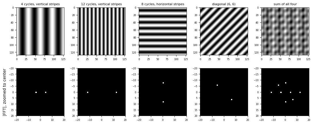
Each pure stripe pattern shows up as just two bright dots in the spectrum, placed symmetrically about the center:
The distance of the dots from the center is the frequency. The 12-cycle stripes have their dots three times as far out as the 4-cycle stripes.
The direction from the center to the dots is perpendicular to the stripes. Vertical stripes vary along , so their dots lie on the horizontal axis, and the diagonal pattern’s dots lie on a diagonal.
There are always two dots because a real-valued cosine is the sum of two complex exponentials, at and . The spectrum of any real image is symmetric this way, so half of it is redundant.
The Fourier transform is linear, so the spectrum of the sum of patterns is just the sum of their spectra: all eight dots at once.
A real image is a sum of a great many such stripe patterns, so its spectrum is a whole cloud of “dots”, one per frequency. Smooth, slowly varying content sits near the center; fine detail and sharp edges sit far out. The zero-frequency term at the exact center is just the sum (proportional to the average) of the image.
Image Denoising
We can use the Fourier decomposition of an image to downweight or eliminate noise in an image. In this case the noise is high-frequency patterns.
Following along to this demo.
I = plt.imread('../dip_pics/moonlanding.png')
arr_info(I)
((474, 630), dtype('float32'), np.float32(0.0), np.float32(1.0))plt.figure(figsize=(4,3))
plt.imshow(I, cmap='gray');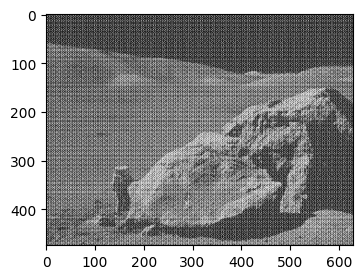
im_fft = fft2(I)arr_info(im_fft)((474, 630),
dtype('complex64'),
np.complex64(-9421.1-5242.114j),
np.complex64(126598.46-0j))We see that the fft2 of the image is an array of complex numbers, representing coefficients of certain frequency patterns in the image. Each complex number encodes both how much of a stripe pattern is present (its magnitude) and where the stripes are shifted to (its phase, or angle). Let’s look at the magnitude spectrum. Given the vast range of values, we’ll plot in the log space for visualization.
plt.figure(figsize=(4,3))
plt.imshow(np.abs(im_fft), norm=LogNorm(vmin=5), cmap='gray');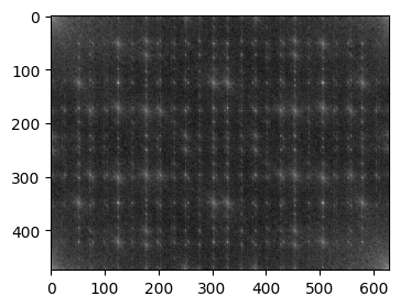
Also, given the symmetries of the different frequency components, we can use fftshift to bring the lower-frequency components to the center of the figure. This is useful because often the lower-frequency components have most of the energy or power of the signal. (Recall that the average was often a pretty good approximation to a block. This is equivalent to the zero frequency, right?)
In the unshifted spectrum above, the low frequencies are split among the four corners, since fft2 puts zero frequency at index and the negative frequencies at the end of each axis. fftshift swaps the quadrants so that zero frequency is in the center, the layout we used for the stripe patterns.
plt.figure(figsize=(4,3))
plt.imshow(np.abs(fftshift(im_fft)), norm=LogNorm(vmin=5), cmap='gray');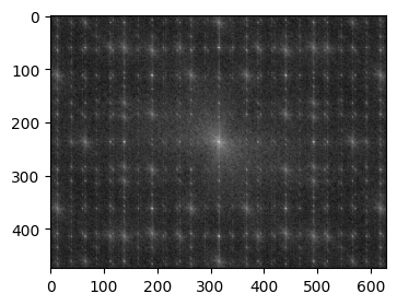
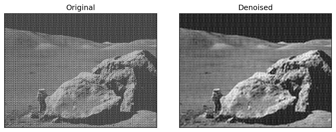
Besides the expected bright blob of low frequencies in the center, this spectrum has a striking regular grid of bright spots. Look closely at the original moon image and you’ll see why: it is corrupted by a fine, regular pattern of dots. A periodic pattern like that is a sum of just a few pure frequencies, so in the spectrum it concentrates into isolated spikes, well separated from the image content. That makes it easy to remove in the frequency domain, and very hard to remove with any small spatial filter.
Now let’s zero-out the high-frequency components that we don’t want to keep.
# For convenience
def plot_spectrum(im_fft, shift=True):
    plt.figure(figsize=(4,3))
    if shift:
        plt.imshow(np.abs(fftshift(im_fft)), norm=LogNorm(vmin=5), cmap='gray')
    else:
        plt.imshow(np.abs(im_fft), norm=LogNorm(vmin=5), cmap='gray')
    plt.colorbar()
keep_fraction = 0.1
im_fft2 = im_fft.copy()
r, c = im_fft2.shape
im_fft2[int(r*keep_fraction):int(r*(1-keep_fraction))] = 0
im_fft2[:, int(c*keep_fraction):int(c*(1-keep_fraction))] = 0
plot_spectrum(im_fft2)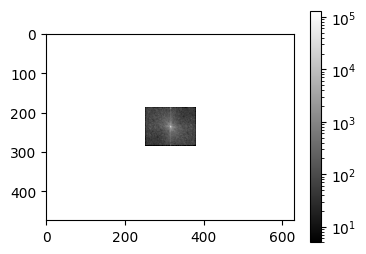
We kept only the frequencies within 10% of zero along each axis. That’s a box in the center of the shifted spectrum, so just 4% of the coefficients, and we’ve zeroed the other 96%. The white surround isn’t really a display error: is undefined, so LogNorm masks the zeros, and masked pixels are drawn transparent, letting the white figure background show through.
I_denoised = ifft2(im_fft2).real
arr_info(I_denoised)
((474, 630), dtype('float32'), np.float32(0.18438978), np.float32(0.79105043))vis_pair(I, I_denoised, cmap='gray', second_title='Denoised', show_ticks=False)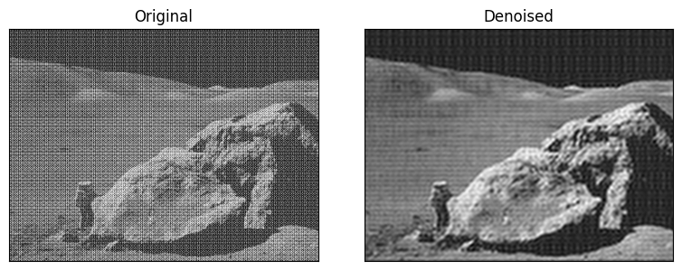
The periodic dot pattern is almost entirely gone, from keeping only 4% of the Fourier coefficients! Of course, this crude low-pass “box” also threw away genuine fine detail, so the denoised image is softer. And if you zoom in, faint horizontal bands remain in the smooth regions. Some of the noise pattern’s spikes lie close enough to the center to fall inside our box, and an abrupt cutoff like this also tends to cause ringing, faint ripples near strong edges. A more careful approach would zero out just the noise spikes and keep everything else, or use a smoother cutoff, as we’ll do in blurring and sharpening.
Let’s look at the Magnitude and Phase of the FFT
The magnitude image is the magnitude of each complex number, and can be computed with abs, as seen above in plot_spectrum.
J = rgb2gray(plt.imread('../dip_pics/cat_small.png')[..., :3])
J = resize(J, (474, 630))
arr_info(J)
((474, 630),
dtype('float32'),
np.float32(0.00034783443),
np.float32(0.97255963))plt.figure(figsize=(4,3))
plt.imshow(J, cmap='gray');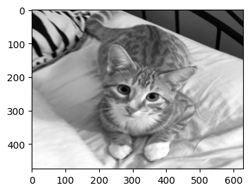
im_fft_J = fft2(J)
plot_spectrum(im_fft_J)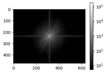
We can also view the phase of the transform. That is we can view the angles of the complex coefficients.
# Thanks https://github.com/numpy/numpy/issues/3621
def phase(z):
    return z / np.abs(z)
plt.figure(figsize=(4,3))
plt.imshow(np.angle(fftshift(im_fft_J)), cmap='gray');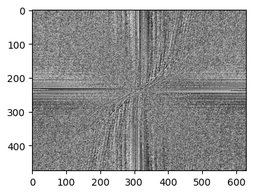
Let’s exchange the phase and magnitude of the two images.
f, ax = plt.subplots(1, 3, figsize=(8,3))
ax[0].imshow(I, cmap='gray')
ax[1].imshow(np.abs(fftshift(im_fft)), norm=LogNorm(vmin=5), cmap='gray')
ax[2].imshow(np.angle(fftshift(im_fft)), cmap='gray');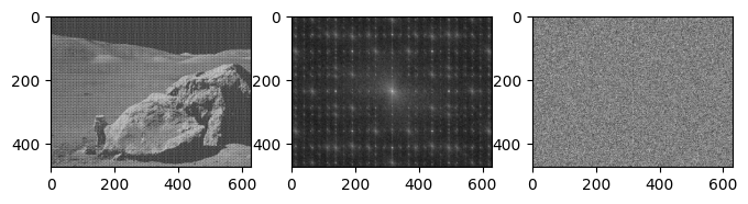
f, ax = plt.subplots(1, 3, figsize=(8,3))
ax[0].imshow(J, cmap='gray')
ax[1].imshow(np.abs(fftshift(im_fft_J)), norm=LogNorm(vmin=5), cmap='gray')
ax[2].imshow(np.angle(fftshift(im_fft_J)), cmap='gray');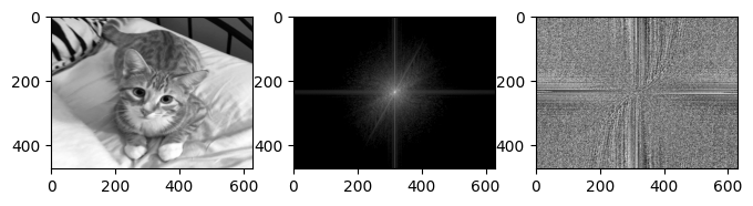
Now let’s swap the phase of J and magnitude of I, or vice versa.
combined = np.multiply(np.abs(im_fft), np.exp(1j*np.angle(im_fft_J)))
imgCombined = np.real(np.fft.ifft2(combined))
plt.figure(figsize=(4,3))
plt.title('moon magnitude + cat phase')
plt.imshow(np.clip(imgCombined, 0,1), cmap='gray');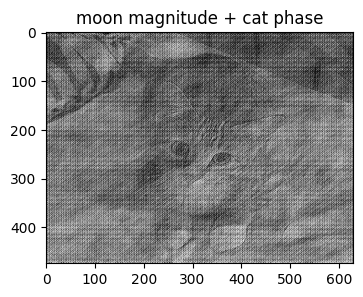
combined = np.multiply(np.abs(im_fft_J), np.exp(1j*np.angle(im_fft)))
imgCombined = np.real(np.fft.ifft2(combined))
plt.figure(figsize=(4,3))
plt.title('cat magnitude + moon phase')
plt.imshow(np.clip(imgCombined, 0,1), cmap='gray');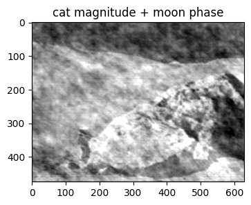
You can see from the above, that where ever the phase image goes, that’s where your perception of the image content goes, with the magnitude really just showing up as structured noise. The phase records where the stripes are positioned, and therefore where the edges and features land, while the magnitude only records how much of each frequency there is. Images of natural scenes all have broadly similar magnitude spectra (lots of low frequency, falling off smoothly), so most of what makes an image this image is in the phase.