 Tutorial](/imageprocessing-awesome/build/matplotlib_tutorial-2a415bd739d32835b55891ff233c726c.jpg)
stough, 202-
Matplotlib is a highly customizable visualization toolkit for Python. So highly customizable in terms of fonts, interactivity, and animations that we cannot possibly cover it in a short notebook like this. For more complete coverage and documentation you should definitely look to the matplotlib tutorials online.
As we use matplotlib constantly and in different ways throughout image processing, most of these usage cases shall be left to the moment we need them. This notebook is meant only to serve as an introduction with more explication.
Imports
The
%matplotlib widgetmagic command starts up the matplotlib visualization package for interactive plotting capability through ipympl. We’ll be usingwidgetusually. Alternatives includeinlinefor static figures (can be very useful to debug) andnotebookif we were using classic Jupyter Notebook.The business with
sys.path.insertis to allow us to import modules from our utility directory (read more here).
%matplotlib inline
import matplotlib.pyplot as plt
import numpy as np

# For importing from alternative directory sources
import sys
sys.path.insert(0, '../dip_utils')

import matrix_utils
Loading and Displaying Images
We can use matplotlib’s pyplot.imread to load images from our file system or even a URL. If successful, the function returns a numpy array (or really ndarray). To test here, we’ll read in one of our book photos.
I = plt.imread('../dip_pics/cat_small.png')type(I)numpy.ndarraymatrix_utils.arr_info(I)((512, 512, 4), dtype('float32'), np.float32(0.0), np.float32(1.0))Using our arr_info utility, we can see that the result is a 512x512x4 matrix of floating point numbers in the range [0,1]. The 512x512 represents the image space, while the x4 means there are four channels in this image. Normally, these four channels represent red, green, blue, and alpha, or opacity. In this case alpha is all 1, which means no transparency.
To view the image we’ll use the pyplot.imshow function. If we’re making multiple plots in a single notebook (usually the case), we’ll also want to instantiate a figure in which to do the plotting, using pyplot.figure.
plt.figure(figsize=(4,4))
plt.imshow(I) # add semicolon ; to silense the printed output.
plt.show()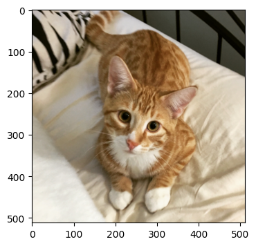
Play with the interactively plotted image above. You should be able to resize it (lower-right corner) or zoom into a particular area (little square button), or a number of other interactions all through click-and-drag.
Important
Copying from the pyplot.imshow documentation, the image data array must be one of the following:
- (M, N): an image with scalar data. The data is visualized using a colormap.
- (M, N, 3): an image with RGB values (0-1 float or 0-255 int).
- (M, N, 4): an image with RGBA values (0-1 float or 0-255 int), i.e. including transparency.
To be specific, floating point pixel values outside of [0,1] may lead to an error, and integer pixel values outside the [0,255] range may be clipped or else even cast (e.g., a pixel value of 256 might be interpretted as 0, wrapping around the [0,255] range), leading to screwy output. So use that arr_info function often.
The image matrix I has three color channels. Each pixel color is actually represented by three color stimuli in red, green, and blue. While we discuss this in more detail elsewhere, for now you can think of I as really a red image, green image, and blue image all pasted together. For the purposes of showing off matplotlib, we’ll display these three separate images.
f, ax = plt.subplots(1,3,figsize=(7,2))
ax[0].imshow(I[...,0], cmap='Reds') # White to deep red.
ax[1].imshow(I[...,1], cmap='Greens')
ax[2].imshow(I[...,2], cmap='Blues')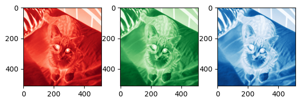
As you can see, we used subplots to create a figure with a one-by-three grid of axes, which is then returned as a list. We then call each axis’ imshow method to plot a different channel of the image. Some notes:
figsizeis in width by height as a tuple, and would be in inches only if all the other non-Python elements of the display pipeline are calibrated appropriately. This is a parameter you’ll likely have to play with.There are scores of colormaps available to you through the
cmapparameter. Choosing which colormap might be appropriate is a much larger discussion that we leave for later.The coordinate system shown for each axis has the origin (0,0) at the upper left corner. This is the matrix or image coordinate system, in contrast to the spatial system you have perhaps internalized, with the origin in the lower left. The difference between the
ijandxysystems can be important when you plot multiple data sources (images and non-image data, like points) on the same axis.Every time you execute the above cell, you generate a new figure. Even though the old ones become inaccessible, the active python kernel is keeping track of them. Execute the cell too many times and you will receive a warning about potential memory usage. This is not usually a problem, but be sure not to put
plt.figure()into large loop unless you’re sure that’s what you want.
f, ax = plt.subplots(1,4,figsize=(8,2), sharex=True, sharey=True)
ax[0].imshow(I)
ax[0].set_title('image')
ax[1].imshow(I[...,0], cmap='Reds_r') # black to red colormap
ax[1].set_title('red channel')
ax[2].imshow(I[...,1], cmap='Greens_r')
ax[2].set_title('green')
ax[3].imshow(I[...,2], cmap='Blues_r')
ax[3].set_title('blue')

[a.axes.get_xaxis().set_visible(False) for a in ax];
[a.axes.get_yaxis().set_visible(False) for a in ax];

plt.tight_layout()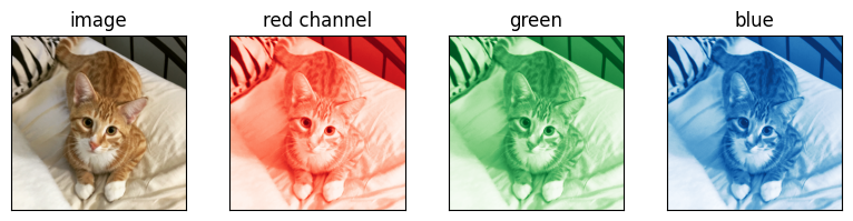
In the above cell I add several additional pieces for better visualization.
Setting
sharexandshareyallow us to zoom and interact with all subplots identically. Give it a shot, it can be quite useful for viewing regions that in the original display might be too small to observe. For example, if you zoom into an area of orange, you might note the constituent red > green > blue.I’ve changed the colormaps used from the ones in the previous figure. I thought a colormap that would make the cat’s eyes dark would appear a little more natural. Again, read more about colormaps.
Image values are shown at the bottom of the figure as you mouse over. Note that the original image, shown in the left-most axis, has all four channels listed.
I’ve added titles to each axis using the
set_titlemethod. Highly recommended to communicate to the reader.I removed the axis markings, which allows more space for the image content I’m trying to display. Try commenting out the lines that begin
[a.axes.get_...and execute the cell again to see the difference.tight_layoutreduces padding between axes, giving even more space for content. Try commenting out the line and re-executing to see the difference.
Note that in later notebooks, some of the details of these plotting behaviors are abstracted away in utility modules like vis_utils.
Plotting Image-derived Information
Maplotlib isn’t only about plotting image data of course. Sometimes you want to plot data about the images! While there are any number of ways to look at imaging data, two that we will regularly use are histograms and a color box. While both methods throw away important spatial relationships between pixels, they still turn out to be useful, especially as we consider color and contrast enhancements.
Let’s take a look at histograms first. For fun we’ll use a different image.
J = plt.imread('../dip_pics/sf.jpg')
matrix_utils.arr_info(J)
((947, 1421, 3), dtype('uint8'), np.uint8(0), np.uint8(255))arr_info tells us this image is different from the previous. First, it only has three channels, again for the red/green/blue colors but missing the alpha/transparency channel that I had. Second, the pixels are not floating point values anymore, but rather 8-bit unsigned integer. Lastly, we can also see that the pixel values cover the entire possible 8-bit range, [0,255]. Well, let’s take a look...
plt.figure(figsize=(4,3))
plt.imshow(J); # semicolon ; to suppress text display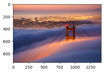
As you mouse over the image above you can see the x and y location of the mouse in the image space, along with the [red, green, blue] values of the pixel at that location.
Histograms
Pyplot has its own histogramming function pyplot.hist that can return histogram data (bin counts, bins, and underlying visual objects if needed) and display that histogram at the same time. numpy.histogram can also be used if needed.
plt.figure(figsize=(5,3))
n, allbins, _ = plt.hist(J.ravel(), bins=np.arange(257))
plt.title("Overall Histogram");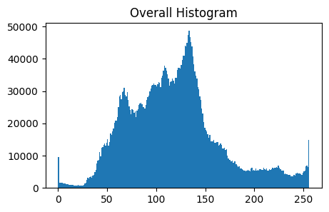
In the above I call ravel to give a 1D representation of the image data to hist. By the way, flatten would do the same thing while also making a copy of the data, unneeded here.
I also told hist what the bins should be through the bins argument. np.arange(257) returns an array of the sequence [0,...,256]. Even though the value 256 never shows up in the image, the pyplot.hist documentation notes that we must include the “left edge of the first bin and the right edge of the last bin” in our sequence argument.
We can also display each of the color channels separately, which can be a very informative way of understanding the relative strength of the different colors in the image...
f, axarr = plt.subplots(1,2, figsize=(9, 3))

axarr[0].imshow(J) #https://matplotlib.org/api/_as_gen/matplotlib.pyplot.imshow.html
axarr[0].set_title('Image')

axarr[1].hist(J[...,0].ravel(), allbins, alpha = .6, label = 'red', color = 'r');
axarr[1].hist(J[...,1].ravel(), allbins, alpha = .6, label = 'green', color = 'g');
axarr[1].hist(J[...,2].ravel(), allbins, alpha = .6, label = 'blue', color = 'cornflowerblue');
axarr[1].legend(loc = 'upper right');
plt.tight_layout()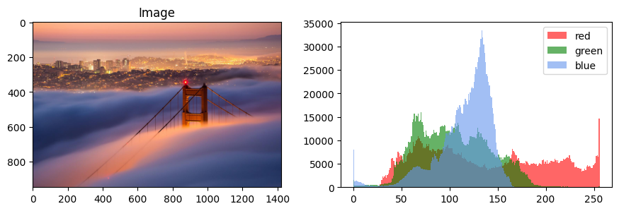
In the above cell we overlay histograms for each color channel on the same axis. We use the alpha transparency parameter to see all three at the same time, label to populate a legend, and color to set the obvious color (see pyplot.hist for all the details). legend can then automatically generate a legend with our labels.
There are disadvantages to the above kind of visualization that must be acknowledged. The histogramming completely eliminates the spatial relationships of pixels with one another, which is where a lot of our understanding of the image contents lie. In the above figure, the image is understood by us pretty obviously as a bridge in fog with a city in the background. But it’s unlikely you could glean that understanding from the overlayed channel histograms. Additionally, any particular pixel has three color values, for red, green, and blue; our histogramming eliminates the actual understanding of the colors in the image. All we could say is that it’s likely for any particular pixel to have a higher red value than green or blue.
Lastly note again, when we do this kind of visualization later, we’re likely to use an abstracted utility function like vis_hists.
3D Plotting
As noted, in addition to ignoring the spatial relationships between pixels, hist also separates the red, green, and blue components from one another. Another interesting visualization that manages to keep all of a pixel’s colors together is the color cube. Here, the x,y,z dimensions of a 3D Euclidean space are equal to the r,g,b components of our image data, so that one pixel becomes one point in the 3D color cube space. I’m showing this here not only because it’s an interesting use case for 3D plotting, but also because we will use this kind of visualization to demonstrate the effects of certain image processing techniques like white balance adjustment or contrast enhancement.
NUMPOINTS = 5000

fig = plt.figure(figsize=(5,5))
ax = fig.add_subplot(111, projection='3d')

# X is the N*M x 3 version of the image.
X = np.stack([J[...,i].ravel() for i in range(3)]).T

# https://numpy.org/doc/stable/reference/random/generated/numpy.random.choice.html
randomInds = np.random.choice(np.arange(X.shape[0]), NUMPOINTS, replace=False)

# Now plot those pixels in the 3d space.
ax.scatter(X[randomInds,0], X[randomInds,1], X[randomInds,2], c=X[randomInds, :]/255)

# Label the axes.
ax.set_xlabel('Red')
ax.set_ylabel('Green')
ax.set_zlabel('Blue');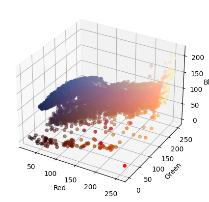
The rgb cube visualization allows us to see that the image contains a lot of red/orange, blue, and yellow pixels.
You can click-and-drag the above visualization to change the view of the data.
We randomly sample only 5000 of the more than a million pixels in the original image. The potential inaccuracy (or really imprecision) of the rgb cube visualization is really then an issue of how consistent the samples are for this image. As we’ll see later, images that we care about and that communicate useful information to us will have this consistency; this is called spatial coherency and is a common characteristic of images that aren’t just random noise. More on this concept later.
This rgb cube visualization will also be available through the
vis_rgb_cubeutility.
This has been a brief introduction to plotting in matplotlib for the purposes of image processing preparedness. You can read more about 3D plotting here or here, or other plotting through the matplotlib tutorials. Have fun!
🧠 Further Efforts
A couple of problems to practice the plotting from this notebook on.
Compare two color cubes. Make the RGB cube scatter plot for the cat image
Iand compare it with the one above for the San Francisco imageJ. Which regions of the cube does each image fill, and how does that match what you see in the images?
Guidance: The cat image has a fourth (alpha) channel, so useI[...,:3]. Check its datatype and range witharr_infofirst, becausescatter’sc=colors must be floats in . Reuse the random-sampling idea above rather than plotting every pixel.How many samples are enough? Re-run the cube for
JwithNUMPOINTSat 500, 5000, and 50000. At what point does the overall shape of the point cloud stop changing?
Guidance: Plot them side by side (fig.add_subplot(1, 3, k, projection='3d')) and rotate them to the same view. Relate what you see to the note above about spatial coherence: why can a few thousand of a million pixels describe the image’s colors well?