stough 202-
Here we’ll explore a bit more about color.
%matplotlib inline
import matplotlib.pyplot as plt
import numpy as np
import skimage.color as color

# For importing from alternative directory sources
import sys
sys.path.insert(0, '../dip_utils')

from matrix_utils import arr_info
from vis_utils import (vis_rgb_cube,
                       vis_hsv_cube,
vis_hists)Vision
Color as light (as from displays or captured by cameras) is additive in nature. Humans (who can see) have photoreceptor cells, specially-developed nerve cells called rods and cones. These cells are located in the retina, where light coming into the eye is focused. When you direct your vision somewhere, you are training the light toward your fovea, where the concentration of cones (4 to 7 million of them) is highest. The rods, on the periphery of vision, provide context and low-light vision.
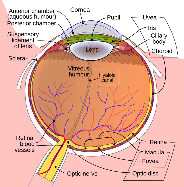
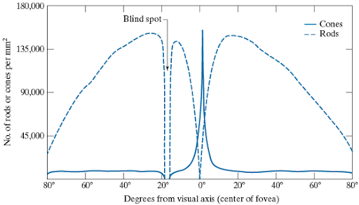
Eye diagram: Rhcastilhos and Jmarchn, CC BY-SA 3.0, via Wikimedia Commons.
Further, the cones are split into three types, red, green, and blue, based on their absorption characteristics. This is how we perceive color, based on the differential stimulation of these three kinds of color-receptive cones to light within the visible spectrum.
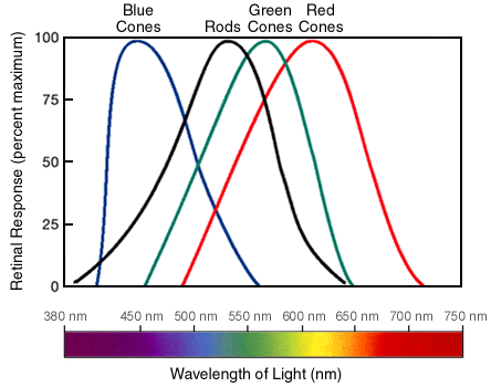
Displays work by blending just three relatively pure red, green, and blue light sources in each pixel. So an image is actually three images or channels, representing the red, green, and blue component images. The matplotlib tutorial shows a nice example of this. When you watch a video you’re actually being exposed to individual frames at such a high frequency (24 typically, 30, 60, or even 120 frames per second) that you perceive motion.
Brightness
We use achromatic Intensity as our measure of brightness. The most common current display technology, and matplotlib, uses 8-bit color depth or quantization. White light is an equal combination of the R,G,B signals, leaving us with just 8 bits to represent all grayscale values, . Regardless of how many gradations (discrete monotonically increasing values) we provide, the display will end up the same.
plt.figure(figsize=(6,1))
plt.imshow(np.tile(np.arange(256), (25,1)), cmap='gray');
# Brightness: more doesn't help.
plt.figure(figsize=(6,1))
plt.imshow(np.tile(np.arange(1024), (100,1)), cmap='gray');
In the above I show a linear grayscale in 256 and 1024 gradations, resulting in identical images due to the display’s and matplotlib’s default 8-bit depth. With the advent of High Dynamic Range (HDR) displays and cameras, more gradations will be possible, allowing for a greater color gamut as well. See more here and here. There is also the possibility of working with HDR images through OpenCV.
RGB Color
With 8-bit color depth in each of the red, green, and blue channels, there are possible colors. I’ve written a couple of visualization tools to think about what colors are in any particular image. One is a histogram while the other visualizes the 3D Color cube. Let’s take a look!
I = plt.imread('../dip_pics/sf.jpg')vis_hists(I)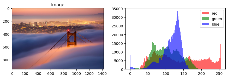
vis_rgb_cube(I)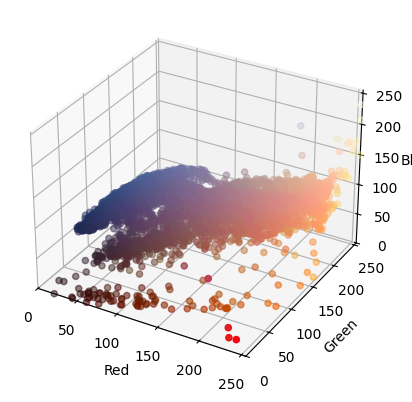
The RGB plot shows each pixel’s position in x,y,z equivalent to the R,G,B channels, while also coloring the pixel according to that R,G,B. That is, the origin is black, as it consists of zero intensity in any of the three color channels, while the point is completely white. The achromatic intensity scale can be seen as the diagonal connecting these points, while the points , , and show as the primary colors red, green, and blue. The other three corners of the cube represent the secondary colors of yellow, magenta, and cyan.
If we uniformly randomly sample the entire octant, this visualization can show us the color cube in 3D as well.
X = np.random.random((100,100,3))

# X = np.random.randn(100,100,3)
# X = (X-X.min())/(X.max()-X.min())
vis_rgb_cube(X)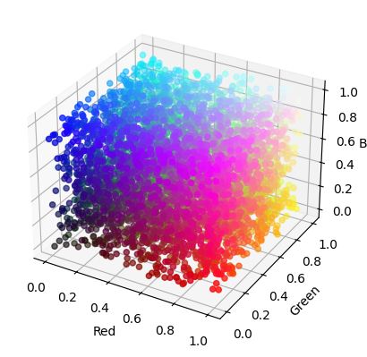
Hue and Saturation (and Value/Intensity)
All the colors of the rainbow! Hue is generally what we think of as color. Bold colors versus muted or pastels differ in what is called Saturation, or the level of purity of the hue/color. Here is a plot of all fully saturated colors then, thanks to this stackoverflow answer.
V, H = np.mgrid[0:1:100j, 0:1:360j]
S = np.ones_like(V)
HSV = np.dstack((H,S,V))
RGB = color.hsv2rgb(HSV)
plt.figure(figsize=(6,2))
plt.imshow(RGB, origin='lower')
plt.xlabel('H') # These don't need to change
plt.ylabel('V')
plt.title('$S_{HSV}=1$')
plt.tight_layout()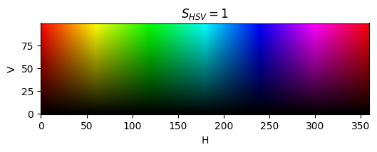
The y-axis in the above plot is all that’s left of our perception of color if you take out hue and saturation; that is, intensity or Value.
One thing you’ll notice in the above plot is that red shows up on both the left and right-hand sides. That’s because this HSV space is thought of as circular.
Let’s try to show this circular nature of hues for some particular saturation and value. Here I’m creating 10K h,s,v triples where saturation and value are held constant while the hue is sampled linearly, converting them to r,g,b, and then displaying them in both the HSV and RGB cube spaces.
hsv = np.stack([np.linspace(0,1,10000),
                .8*np.ones(10000),
                .8*np.ones(10000)]).T
rgb = color.hsv2rgb(hsv)vis_hsv_cube(np.reshape(rgb, (100,100,3)))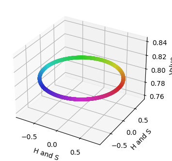
vis_rgb_cube(np.reshape(rgb, (100,100,3)))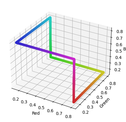
If we uniformly randomly sample the entire RGB space again, we can see the entire HSV colorspace:
vis_hsv_cube(np.random.random((100,100,3)))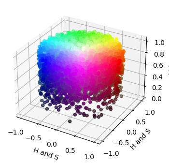
Chromaticity
Hue and saturation together describe the quality of a color, independent of how bright it is. A dim orange and a bright orange are, in some sense, the same color. This brightness-free part of color is called chromaticity, and one simple way to get at it is to divide each pixel’s R, G, B by their sum:
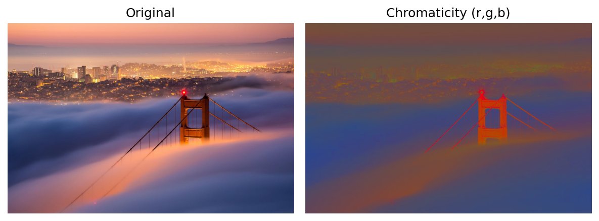
Since , only two of these numbers are independent: once you know and , you know . Chromaticity is a two-dimensional quantity, obtained by “projecting out” the intensity dimension of the 3D color cube. Let’s see what our San Francisco image looks like with its intensity normalized away.
If = I.astype('float')
total = If.sum(axis=-1, keepdims=True)
chroma = If / np.maximum(total, 1)   # avoid dividing by zero at pure black pixels

f, ax = plt.subplots(1, 2, figsize=(8,3), sharex=True, sharey=True)
ax[0].imshow(I)
ax[0].set_title('Original')
ax[1].imshow(chroma / chroma.max())  # rescale just so it's bright enough to see
ax[1].set_title('Chromaticity (r,g,b)')
[a.set_axis_off() for a in ax];
plt.tight_layout()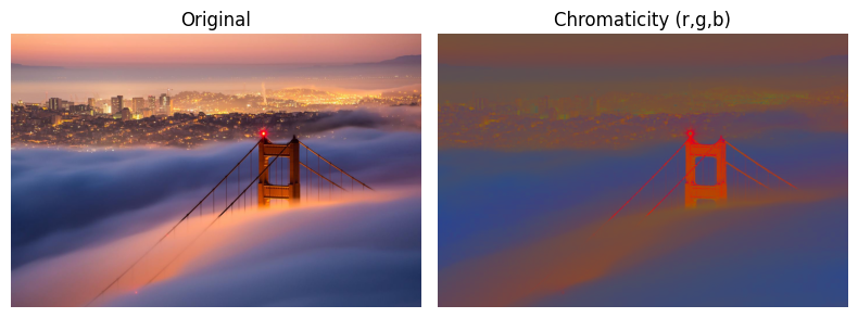
The bright, glowing fog and the darker fog in shadow now look nearly alike, and the city lights no longer stand out as bright spots. Only the ratios between channels remain, so what’s left is the color: bluish fog, orange-pink sky and lights, and the strongly red bridge tower, which now pops out more than in the original. (Very dark pixels get noisy, since a ratio of tiny numbers is unreliable.) This is part of why chromaticity is useful in practice: you can find a colored object, like skin, foliage, or a red bridge, regardless of how it’s lit.
Because chromaticity is 2D, we can plot every pixel of an image in a flat plane, colored by its actual color:
rg = chroma[..., :2].reshape(-1, 2)
cols = I.reshape(-1, 3) / 255.0
which = np.random.choice(len(rg), 5000, replace=False)

plt.figure(figsize=(4,4))
plt.scatter(rg[which, 0], rg[which, 1], c=cols[which], s=4)
plt.plot([0, 1, 0, 0], [0, 0, 1, 0], 'k-', lw=.5)  # the valid triangle r+g<=1
plt.xlabel('r'); plt.ylabel('g')
plt.title('Pixel chromaticities')
plt.axis('equal')
plt.tight_layout()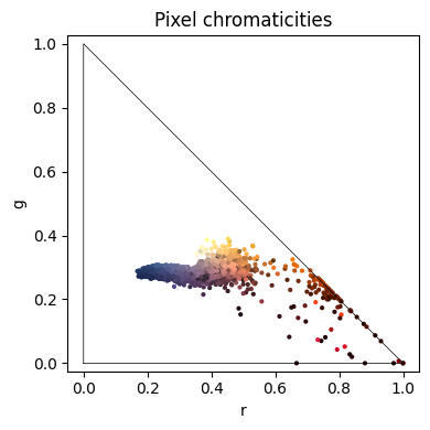
Every possible chromaticity lies in the triangle with corners at pure red , pure green , and pure blue (where means ). The achromatic grays, whites and blacks all collapse to the single point , and the farther a pixel lies from that point, the more saturated it is. The angle around that point corresponds roughly to hue. In our image you can see the blue fog to the left of center, the orange and pink glow to its right, and the saturated red of the bridge reaching toward the red corner. The scattering of very dark points along the bottom edge is that noise from dividing tiny numbers.
The CIE defined a standardized version of this idea, the chromaticity diagram, based on measurements of human vision rather than on any particular display’s red, green, and blue. We’ll come back to the CIE when we look at L*a*b*.
See more in the HSV tutorial.
At this point we’ve observed two ways of thinking about color. Either as red, green, and blue stimuli for our vision, or potentially a more intuitive understanding of color as hue, saturation, and value. There are still other colorspaces that are very useful in digital image processing, including YCbCr and L*a*b*. Take a look at those demos next.