stough 202-

Pretty much exactly from DIP 3-3.2 from Gonzalez/Woods.
Showing interesting transfer functions on a gray image of a flower. This is a compact companion to the transfer functions notebook: one image, five transfer functions , and their curves shown right above their results, so you can connect the shape of each curve to what it does to the image.
%matplotlib inline
import matplotlib.pyplot as plt
import numpy as np
import matplotlib.colors as mcolors
import skimage.color as color
from ipywidgets import VBox, HBox, FloatSlider

# For importing from alternative directory sources
import sys
sys.path.insert(0, '../dip_utils')

from matrix_utils import arr_info
from vis_utils import (vis_rgb_cube,
                       vis_hists,
                       vis_pair,
                       lab_uniform)
I = plt.imread('../dip_pics/grayflower.jpg').astype(float)
I = I - I.ravel().min()
I = 255*(I/I.ravel().max())
if (len(I.shape) > 2):
Ig = 0.2989 * I[..., 0] + 0.5870 * I[..., 1] + 0.1140 * I[..., 2]
I = Ig
plt.figure(figsize=(5,4))
plt.imshow(I, cmap = 'gray');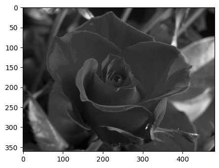
The image is rescaled to span the full range , and converted to grayscale if it was stored in color (with the usual luminance weights, much like the in YCbCr).
x = np.arange(256)

# Let's add the linear (do nothing) transform.
Ilin = I.copy()
ylin = x.copy()


#Compute and renormalize 4 transforms.
Ilog = np.log2(I+1)
ylog = np.log2(1+x)
Ilog = Ilog/Ilog.ravel().max()
ylog = 255*(ylog/ylog.max())


Isqrt = np.sqrt(I)
ysqrt = np.sqrt(x)
Isqrt = Isqrt/Isqrt.ravel().max()
ysqrt = 255*(ysqrt/ysqrt.max())

Isquared = np.multiply(I, I)
ysquared = np.multiply(x, x)
Isquared = Isquared/Isquared.ravel().max()
ysquared = 255*ysquared/ysquared.max()

Iinv = 255.0-I
yinv = 255-x

#Now plot them. Mix the images though
f, ax1 = plt.subplots(1,5, figsize = (10,2), sharex=True, sharey=True)
ax1[0].set_title('linear')
ax1[0].plot(x, ylin)
ax1[1].set_title('log')
ax1[1].plot(x, ylog)
ax1[2].set_title('sqrt')
ax1[2].plot(x, ysqrt)
ax1[3].set_title('square')
ax1[3].plot(x, ysquared)
ax1[4].set_title('inv')
ax1[4].plot(x, yinv)

plt.tight_layout()

f, ax2 = plt.subplots(1,5, figsize = (10,2), sharex=True, sharey=True)
ax2[0].imshow(Ilin, cmap='gray')
ax2[1].imshow(Ilog, cmap='gray')
ax2[2].imshow(Isqrt, cmap='gray')
ax2[3].imshow(Isquared, cmap='gray')
ax2[4].imshow(Iinv, cmap='gray')

[a.axes.get_xaxis().set_visible(False) for a in ax2];
[a.axes.get_yaxis().set_visible(False) for a in ax2];
plt.tight_layout()

Read each curve as “input intensity on the x-axis, output intensity on the y-axis”. Where a curve is steep, a small range of input intensities gets spread over a large range of outputs: contrast increases there. Where it’s flat, inputs get squeezed together and contrast is lost.
linear: the identity, . Nothing changes.
log, : very steep for dark values and flat for bright ones. The shadows of the flower open up dramatically, but the bright petals compress together and wash out.
sqrt, : the same idea, more gently. It’s a gamma of .
square, : the opposite, . It’s flat in the darks and steep in the brights. Most of the image sinks into black, but differences among the brightest petals are exaggerated.
inv, : the photographic negative. It has a constant slope (just negative), so it doesn’t change contrast at all, only which end is light. Even so, details can be easier to see on a light background than a dark one.
Notice that each transformed image is rescaled for display afterward, so we’re comparing the shapes of the transforms, not their absolute brightness.