Transfer Functions
stough 202-
Enhancement: manipulating an image to be more suitable for the application
Human perception
Compressibility
Further analysis (making features easier for an algorithm, not just a person, to find)
Contrast: difference in color or luminance between nearby elements or over a whole image
quantifiable globally through histograms
think of the difference between the Gaussian and Uniform distributions and how that looked in the RGB cube.
In this notebook we’ll consider some images that could be enhanced by improving the contrast. We’ll apply Transfer functions of various type, which can all very generally be expressed as
where is the image intensity or color stored in the file, and is a corrected or transformed intensity that we want the display device to use. This transfer function applies to each pixel independently; it maintains no information about the local context.
Transfer functions are already being used.
Whether or not we use them to enhance our images, transfer functions are already ubiquitous. Every display device uses some mapping to turn the image file’s pixel intensities into voltages for the display elements/pixels (or pigment mixtures for the printer). These mappings can be constructed to conform to human perception, or to exaggerate or understate nominal differences. The mapping generally used in digital displays is a Gamma function, which we’ll actually use below.
So doing nothing to your image is in fact a decision, and may be a poor one if your goal is to communicate something through the image.
Imports
Note the addition of the vis_pair function, which can nicely plot an original and changed image for side-by-side comparison.
%matplotlib inline
import matplotlib.pyplot as plt
import numpy as np
import matplotlib.colors as mcolors
import skimage.color as color
from ipywidgets import VBox, HBox, FloatLogSlider

# For importing from alternative directory sources
import sys
sys.path.insert(0, '../dip_utils')

from matrix_utils import arr_info
from vis_utils import (vis_rgb_cube,
                       vis_hsv_cube,
                       vis_hists,
                       vis_pair,
                       lab_uniform)
Windowing and Piece-wise Linear Transforms
The simplest transfer function one might imagine is the linear function
where and are constants. Let’s consider a particular case.
I = plt.imread('../dip_pics/got_tooDark.jpg')
vis_hists(I, bins=np.arange(257))
arr_info(I)
((1200, 2134, 3), dtype('uint8'), np.uint8(0), np.uint8(204))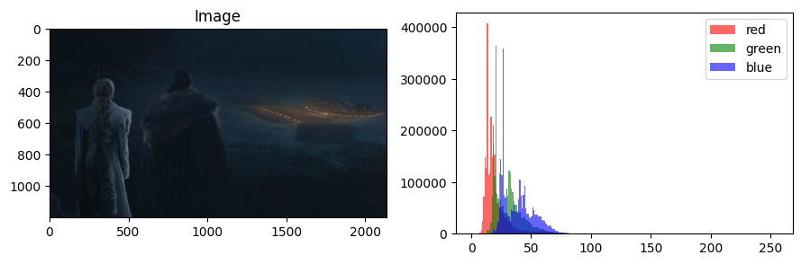
arr_info tells us this image has data that are 8-bit unsigned integer. Given that there are 3 color channels, that implies a 24-bit color image, very typical. From the histograms though, we can also see this image has pretty much all of its pixels bunched up in the lower half of the nominal display range . Notwithstanding the photographer’s intent in choreographing the shot, let’s “correct” for my old eyes. A simple linear function might do. But we have to remember that matplotlib expects three-channel images to stay in (if integer type).
def simple_linear(I, A = 1.0, B = 0.0):
    '''
    simpleLinear(I, A = 1.0, B = 0.0): return a linearly transformed image with the
    provided constants A and B.
    '''
    Tr = lambda x: A*x + B
    J = Tr(I.astype('float'))
    return np.clip(J, 0, 255).astype('uint8')
The above function implementation has three key steps:
Create a
lambdafunctionTrthat applies theMake the initial output image
Jthat isTrapplied to the original image. We assure we’re doing floating math by sendingI.astype('float'). Note that this initial outputJcould have values outside and will be floating point data, neither of which are valid for integer image display through matplotlib.The return statement both clips the image
Jto ensure a range and casts to unsigned integeruint8datatype.
We can even see practically what this simple linear transform does in transforming the input intensity.
x = np.arange(256)
plt.figure(figsize=(4,3))
plt.plot(x, x, label='equal')
plt.plot(x, simple_linear(x, A = 3), label = '3x+0')
plt.xlabel('Input Intensity')
plt.ylabel('Output Intensity')
plt.legend()
plt.tight_layout()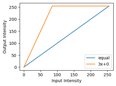
I_corrected = simple_linear(I, A = 3)
vis_pair(I, I_corrected, second_title='scaled by 3')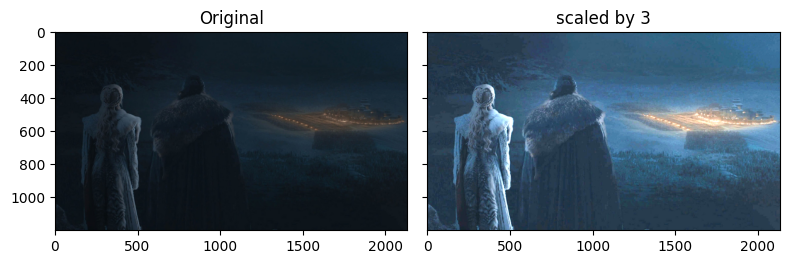
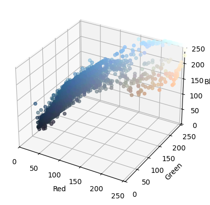
You can see what we did by viewing the histograms, or even (cooler), seeing what happened in the rgb cube!
vis_hists(I, bins=np.arange(257))
vis_hists(I_corrected, bins=np.arange(257))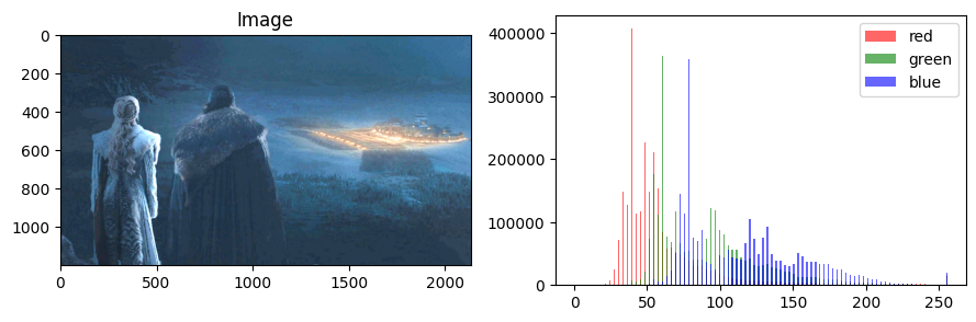
vis_rgb_cube(I)
vis_rgb_cube(I_corrected)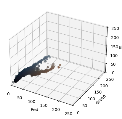
One approach you may think of is to renormalize the intensity so that is exactly . This is of course also a linear transform:
or , and
I_normed = simple_linear(I, A = 255.0/(I.max()-I.min()), B = -255.0*I.min()/(I.max()-I.min()))
vis_pair(I, I_normed, second_title='min-max normed')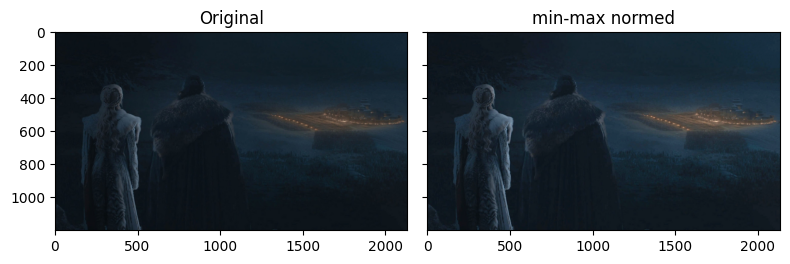
If we plot all of these potential linear maps we can see their varying effect.
x = np.arange(256)
plt.figure(figsize=(4,3))
plt.plot(x, x, label='equal')
plt.plot(x, simple_linear(x, A = 3), label = '3x+0')
plt.plot(x, simple_linear(x, A = 255.0/(I.max()-I.min()), B = -255.0*I.min()/(I.max()-I.min())), label='min-max normed')
plt.xlabel('Input Intensity')
plt.ylabel('Output Intensity')
plt.legend()
plt.tight_layout()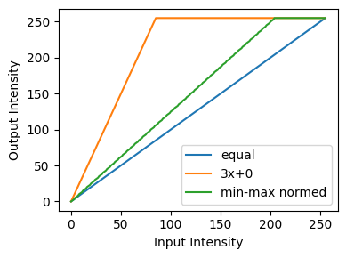
Gaussian Noise Example
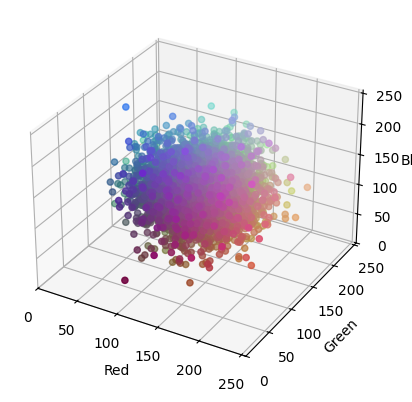
We’ll do one more example with windowing. We’ll use a Gaussian distributed random image that we’ve come to know from previous notebooks. It abstractly represents poor contrast, because its intensities are bunched up relative to a uniform distributed image.
I_uniform = np.uint8(256*np.random.random((100,100,3)))
I_gauss = np.clip(128 + 30*np.random.randn(100,100,3), 0, 255).astype('uint8')
vis_pair(I_uniform, I_gauss, first_title='Uniform Dist', second_title='Gaussian Dist')
vis_rgb_cube(I_gauss)
vis_hists(I_gauss, bins=np.arange(257))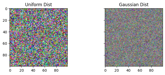
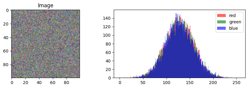
Looking at the histogram of I_gauss, you see that most of the intensities seem to be bunched up in the range. But our output range is , so we have some room to work with. We want to define a transfer function that will dedicate the entire output range to where in the input range our data actually are. Let’s make a function that linearly maps some input range to some output range. While we could formulate this in terms of or the two point form, I like to think of it as mixing: we’re mixing between 0 and 255, and the mixing amount is equal to how far we are along the road from 50 to 200.
def make_linmap(inputrange, outputrange):
    a,b = inputrange
    c,d = outputrange

    return lambda x: (1-((x-a)/(b-a)))*c + ((x-a)/(b-a))*d
The above gives us a linear map defined by input and output ranges, as in our -> attempt above. However, the linear map doesn’t clip the results of the transformation like simple_linear above. Let’s use it in a larger function that takes care of the out-of-bounds issues. We can also see practically the transfer function.
def interval_stretch(I, inputrange, outputrange):
    Tr = make_linmap(inputrange, outputrange)
    J = Tr(I.astype('float'))
    return np.clip(J, 0, 255).astype('uint8')
x = np.arange(256)
plt.figure(figsize=(4,3))
plt.plot(x, x, label='equal')
plt.plot(interval_stretch(x, [50,200], [0,255]), label='enhanced middle')
plt.xlabel('Input Intensity')
plt.ylabel('Output Intensity')
plt.legend()
plt.tight_layout()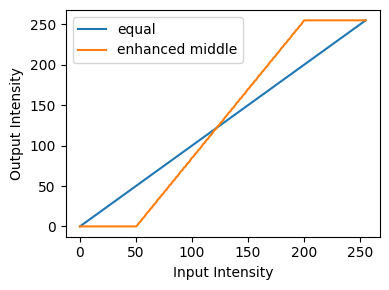
As you can see, our attempted interval_stretch will stretch the middle of the input range, where our data actually are, to the entire display range .
I_gauss_enhanced = interval_stretch(I_gauss, [50,200], [0,255])vis_hists(I_gauss_enhanced)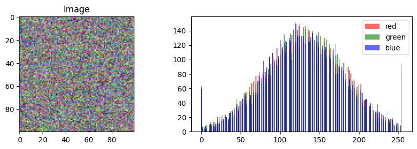
vis_pair(I_gauss, I_gauss_enhanced, first_title='Original Gauss', second_title='Enhanced Gauss')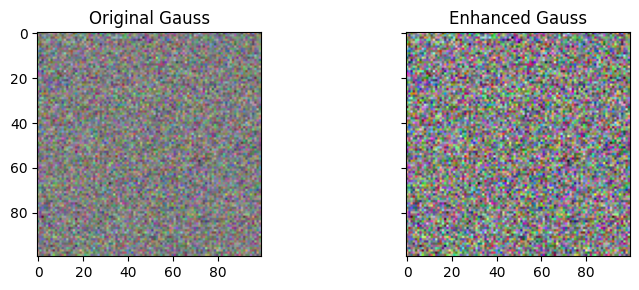
vis_rgb_cube(I_gauss)
vis_rgb_cube(I_gauss_enhanced)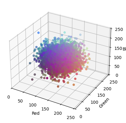
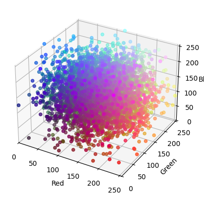
We can see that our windowing redistributed the image intensities to better cover the whole display range or RGB cube. We call this windowing because we dedicate the entire display range to a window, or valid input range, of intensities (in this case, ).
We can also see from the histogram that values which were already outside of our arbitrary range start piling up at the tail ends of I_gauss_enhanced’s histogram. The tighter we set our window (e.g., ), the more pixels that will just end up with their intensities maxed out at 0 or 255. Go ahead and try it out.
Power Transforms
While windowing has the very simple effect of linearly scaling input ranges, we see that it can create artifacts at the extreme ends. Additionally the perception of light itself is nonlinear, so that maybe a nonlinear approach could be better.
The nonlinear transfer function that is used to map intensity to voltage in display devices is commonly the Gamma function:
Functions of this form also include what we think of as powers or roots. For example, corresponds to squaring the intensity, while the reciprocol leads to the square root. We can plot this transfer function for various values of , with set to correct the output scale to
x = np.arange(256)
plt.figure(figsize=(4,3))
plt.plot(x, x, c = 'blue', label = rf'$\gamma$ = 1')
for gamma in [2.4, 5.0]:
    c = 255.0/(np.power(255.0, gamma))
    cinv = 255/(np.power(255.0, 1/gamma))
    plt.plot(x, c*np.power(x,gamma), label = f'{gamma:.01f}')
    plt.plot(x, cinv*np.power(x,1/gamma), label = f'{1/gamma:.02f}')

plt.xlabel('Input Intensity')
plt.ylabel('Output Intensity')
plt.legend()
plt.tight_layout()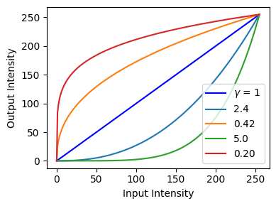
You can see that where the bulk of an image’s intensities are can inform you as to a good that can enhance the contrast in the image. In the above I intentionally place 2.4 and its reciprocal (0.42) in the plot because 2.4 is special: it is a standard gamma value for High Dynamic Range (HDR) content for movies viewed in darker rooms.
Here is an interactive visualization to play around with it for yourself.
I = plt.imread('../dip_pics/world_overexposed.jpg')
vis_hists(I, bins=np.arange(257))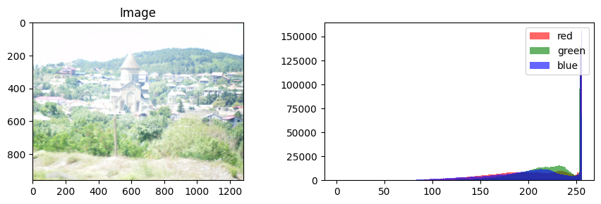
def applyGamma(I, gamma = 1):
    c = 255.0/(np.power(255.0, gamma))
    J = c*np.power(I.astype('float'), gamma)
    return J.astype('uint8')
pass # (static) plt.ioff()
# We'll use a log slider
gamma_slider = FloatLogSlider(
value=1,
base=10,
min=-2, # max exponent of base
max=1, # min exponent of base
step=0.1, # exponent step
description='Log Gamma'
)
# Setting up the figure.
fig_args = {'num':101, 'frameon':True} # , 'gridspec_kw':{'width_ratios': [1, 1, 1]}}
fig, ax = plt.subplots(1,3, figsize=(8,3), **fig_args)
fig.canvas.header_visible = False
# assign the display artists I'll update
ax[0].imshow(I)
mplot = ax[1].plot(x, x)
ax[1].set_aspect('equal', 'box')
ax[1].set_title('Gamma Curve')
rdisp = ax[2].imshow(I)
ax[0].set_title(f'Original (1.0)')
rtext = ax[2].set_title(f'Gamma: {gamma_slider.value:.01f}')
[a.axes.get_xaxis().set_visible(False) for a in ax];
[a.axes.get_yaxis().set_visible(False) for a in ax];
def update_image(change):
global I, mplot, rdisp, rtext
J = applyGamma(I, gamma_slider.value)
mplot[0].set_data(x, applyGamma(x, gamma_slider.value))
rdisp.set_array(J)
rtext.set_text(f'Gamma: {gamma_slider.value:.01f}') #hue_slider.value
fig.canvas.draw()
fig.canvas.flush_events()
gamma_slider.observe(update_image, names='value')
plt.tight_layout()
pass # (static) VBox([gamma_slider, fig.canvas])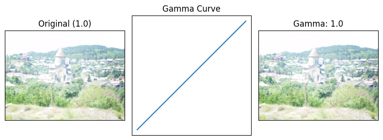
# Close the above interactive demo figure, so that it won't appear later.
plt.close(101)
plt.ion()
<contextlib.ExitStack at 0x7f5c93f24fd0>Log and Miscellaneous Transforms
Other nonlinear families often used for image enhancement are logs and their inverse the exponentials:
x = np.arange(256)
plt.figure(figsize=(4,3))
plt.plot(x, x, c = 'blue', label = 'equal')
plt.plot(x, (255/8)*np.log2(1 + x), label = '$log_{2}$')
plt.plot(x, np.power(2,(256/255)*x/32)-1, label = '$2^{x/32}$')


plt.xlabel('Input Intensity')
plt.ylabel('Output Intensity')
plt.legend()
plt.tight_layout()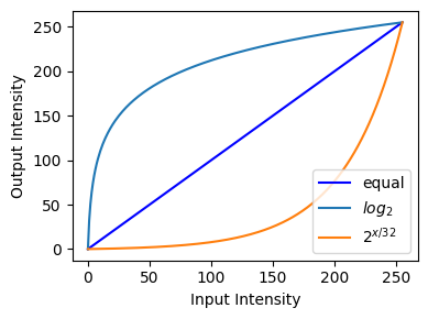
(In the above code there are some confounding bits to get the output correct. These come from the fact that the discrete interval , if understood as continous, is the right-open interval .)
From the plot above we can see that the function has the effect of dedicating much of the display range to the darker pixels in the image. Further this contrast stretching is dynamic (nonlinear) in the input range. For example pixel instensities that are 50 units apart at the dark end of the domain will be mapped to intensities that are 150+ apart in the output range, while the same difference of 50 units at the high end will end up being compressed to about 10.
Let’s see what this does to a severely underexposed image.
I = plt.imread('../dip_pics/underExposed.jpg')
vis_hists(I, bins=np.arange(257))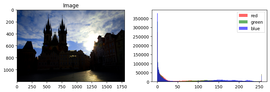
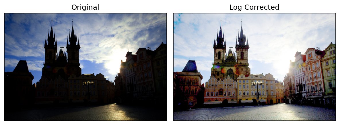
I_log_corrected = ((255/8)*np.log2(1.0 + I)).astype('uint8')vis_pair(I, I_log_corrected, second_title='Log Corrected', show_ticks=False)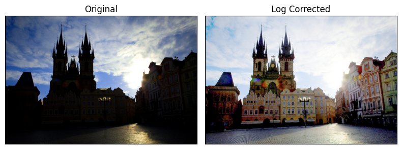
In the above you can see clearly the differential contrast adjustment in the dark and light areas of the image. In this image the transform greatly expanded contrast on the dark buildings, but at the cost of reducing the contrast in the bright sky.
🔨 Your Turn: Log Correction in Lab Space
You might notice a few additional artifacts in our corrected image above. For example the blue sky has turned a kind of aqua (maybe?). Additionally the colorful lens flare on the church and the blue tone of the leftmost rooftop are likely artifacts of the intense scaling done at the very low end of the input range, and not the most faithful representation of the underexposed foreground in reality. (Not that faithfulness to reality has to be the goal). Often in image acquisition, very small differences in R, G, and B are unreliable when found at the extreme low end.
We would like to contrast-enhance the original underexposed image in a way that does not change hue too drastically (blue sky turning aqua). Conveniently then, in the Color module we saw several alternative colorspaces that separate the “color” from the brightness/value/luminance dimension of perception, and we can use any of these instead of RGB as above. Among HSV, YCbCr, and Lab, let’s try Lab. If we transform the Luminance (L) only, leaving the chromaticity dimensions (a, b) constant, we might more objectively enhance the contrast in the underexposed foreground.
Task: Log-correct the underexposed image I by transforming only its L channel in Lab space, then convert back to RGB and show it next to the RGB log correction I_log_corrected from above. Does the sky keep its hue? Is the foreground as well lit?
Guidance:
Convert with
color.rgb2laband back withcolor.lab2rgb. Work on a copy, so thatIitself is unchanged.L lives in , not . Our log curve above was built to send and ; you need a version of it that sends and . Values outside can cause errors or strange colors when converting back.
Make frequent use of
arr_infoto check the datatype and range after every step: what doesrgb2labexpect as input, and what doeslab2rgbgive you back?vis_pair(I_log_corrected, your_result, ...)withshow_ticks=Falsemakes the comparison easy. Plotting the histogram of the L channel before and after withvis_histsshows the effect directly.