stough 202-
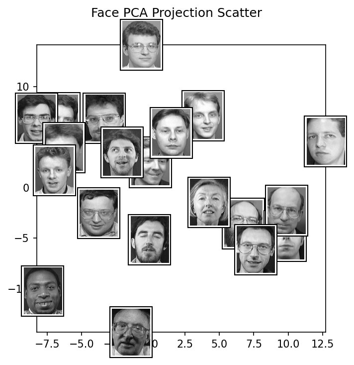
A look at PCA to scatter the ORL faces database
The ORL (or AT&T) database has 400 grayscale photos of faces: 40 people, 10 photos each, with varied lighting, expression, glasses, and slight changes of pose. Each image is pixels, so each face is a single point in a 10304-dimensional space. We obviously can’t look at that space directly, but with PCA we can find the handful of directions in it along which faces vary the most, and look at the faces along those. This is the classic eigenfaces approach (Turk and Pentland, 1991). See data_paths and the README for where the dataset needs to be.
%matplotlib inline
import matplotlib.pyplot as plt
import numpy as np
from matplotlib.offsetbox import (OffsetImage,
                                  AnnotationBbox)
from sklearn.decomposition import PCA

from torchvision import transforms
from torchvision.datasets import ImageFolder

# For importing from alternative directory sources
import sys
sys.path.insert(0, '../dip_utils')
from data_paths import orl_root
NUMFACES = 20 # Number of random faces to display in the first scatterplot
NUMSUBJECTS = 3 # Number of subjects to display in the subject-specific scatter

imshape = (112, 92)
orl_faces = ImageFolder(orl_root(),
transform=transforms.Compose([
transforms.Grayscale(),
transforms.ToTensor(),
transforms.Lambda(lambda x: np.array(x).ravel())
]))
faces = np.stack([orl_faces[i][0]
for i in np.random.choice(len(orl_faces), NUMFACES)])
allfaces = np.stack([orl_faces[i][0] for i in range(len(orl_faces))])faces.shape, allfaces.shape# Now get 10 most important 10304-d directions in the space of faces.
pca = PCA(n_components=10)
Xp = pca.fit_transform(allfaces)
# Xp is actually 400x10 here: each of the 400 images is now
# projected into the 10-d pca space.
print('Explained variation per principal component: \n{}'.\
format(pca.explained_variance_ratio_))
f, ax = plt.subplots(1,3, figsize=(8,3), sharey=True, sharex=True)
f.suptitle('Average Face and Two Principal Components')
ax[0].imshow(np.reshape(allfaces.mean(axis=0), imshape), cmap='gray')
ax[0].set_title('Average Face')
# pca.components_ is 10 x 10304 here, representing the most meaningful
# directions in the 10304-d space of face images.
ax[1].imshow(np.reshape(pca.components_[0,:], imshape), cmap='gray')
ax[1].set_title('PCA 1');
ax[2].imshow(np.reshape(pca.components_[1,:], imshape), cmap='gray')
ax[2].set_title('PCA 2');The first 10 components together explain about 60% of the variation among the 400 faces, with the first two about 18% and 13%.
Each principal component is itself a 10304-dimensional vector, so we can display it as an image: these are the “eigenfaces”. Gray here doesn’t mean gray. The images are displayed with values scaled to fill the colormap, and what matters is where the component is strongly positive (bright) or negative (dark), because that’s how adding it changes the average face. The first components tend to capture the largest, broadest differences in these photos, like overall lighting and how bright the face is against the background, more than fine facial features. We’ll look at what each one does more directly in Component Spans.
# Now scatter some random faces in the pca dimensions.
# Xp from above is already 320 x 10, the 10-pca dimensional
# projection of each image.

# Which images to display is randomized, so that's it's different each time run.
np.random.seed() # Comment out this line to ensure the same images are displayed each run.
whichfaces = np.random.choice(len(allfaces), NUMFACES, replace=False)
xys = Xp[whichfaces, :]


f2, ax2 = plt.subplots(figsize=(5,5))
f2.suptitle('Face PCA Projection Scatter')

"""
How to scatter images in a plot, instead of points for example:
https://matplotlib.org/examples/pylab_examples/demo_annotation_box.html
Also useful:
https://stackoverflow.com/questions/22566284/matplotlib-how-to-plot-images-instead-of-points?utm_medium=organic&utm_source=google_rich_qa&utm_campaign=google_rich_qa
and:
https://stackoverflow.com/questions/48896088/matplotlib-plotting-images-instead-of-points-stretches-images
"""
for i, xy in zip(whichfaces, xys):
    arr_img = np.reshape(allfaces[i, :], imshape)

    imagebox = OffsetImage(arr_img, zoom=0.4, cmap='gray')
    imagebox.image.axes = ax2

    # xy is 10-d here, just need the first 2 to plot though.
    ab = AnnotationBbox(imagebox, xy[:2],
                        pad=0.2,
                        )

    ax2.add_artist(ab)

ax2.set_xlim(xys[:,0].min(), xys[:,0].max())
ax2.set_ylim(xys[:,1].min(), xys[:,1].max())
plt.show()
Expected output (what the cell above should show, if you can’t run it)
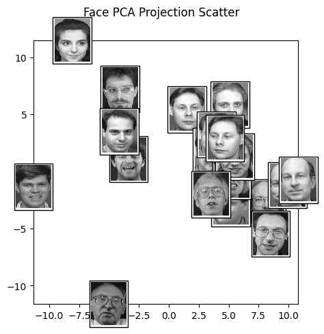
Here each face is placed at its first two PCA coefficients. Faces near each other in this plot are faces that look alike in the two ways faces vary most: similar overall brightness and lighting, similar head shape and hair. Run the cell again to scatter a different random set.
# Now, scatter just NUMSUBJECTS different subjects in the space,
# see if they cluster nicely.
# ImageFolder labels the subjects 0 ... 39 (its folders are named 1 ... 40).
whichsubjects = np.random.choice(len(orl_faces.classes), NUMSUBJECTS, replace=False)

alltargets = np.stack([orl_faces[i][1] for i in range(len(orl_faces))])

f3, ax3 = plt.subplots()

for i, label in enumerate(alltargets):
    if label in whichsubjects:
        arr_img = np.reshape(allfaces[i, :], imshape)

        imagebox = OffsetImage(arr_img, zoom=0.4, cmap='gray')
        imagebox.image.axes = ax3

        ab = AnnotationBbox(imagebox, Xp[i,:2],
                            pad=0.2,
                            )

        ax3.add_artist(ab)

ax3.set_xlim(Xp[:,0].min(), Xp[:,0].max())
ax3.set_ylim(Xp[:,1].min(), Xp[:,1].max())
plt.suptitle(f'Face PCA Scatter for Subjects {[orl_faces.classes[s] for s in whichsubjects]}')
plt.show()
Expected output (what the cell above should show, if you can’t run it)
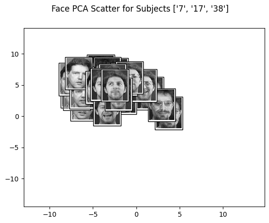
Now we show all ten photos of each of three randomly chosen people. Each person’s photos tend to clump together, even though PCA was never told who is who. Faces of the same person really are near each other in face space, which is the basis for eigenface recognition: project a new photo into the PCA space and find the nearest known faces. Run this cell a few times. Some people’s clusters overlap, and in just 2 of the 10 dimensions some separation is lost.
Let’s add a t-sne visualization.
PCA is linear: its 2D view is a flat projection, like a shadow of the 10-dimensional points on a wall. t-SNE is a non-linear method that instead tries to place points in 2D so that points that are near each other in the high-dimensional space stay near each other in the plot. It distorts large distances freely in order to preserve neighborhoods. Below, we run t-SNE on the 10 PCA coefficients of every face, and color each face by who it is.
# Ripped from: https://medium.com/@luckylwk/visualising-high-dimensional-datasets-using-pca-and-t-sne-in-python-8ef87e7915b
from sklearn.manifold import TSNE

mycolors = .2 + .9*np.random.rand(40,3)
mycolors = np.clip(mycolors, 0, 1)

tsne = TSNE(n_components=2, verbose=1, perplexity=40, max_iter=300)
tsne_results = tsne.fit_transform(Xp)

# Legend: https://matplotlib.org/users/legend_guide.html#creating-artists-specifically-for-adding-to-the-legend-aka-proxy-artists
import matplotlib.patches as mpatches
patch_list = [mpatches.Patch(color=mycolors[i], label=str(i)) for i in range(len(mycolors))]

f, ax = plt.subplots(1,1, figsize=(8,5))

ax.scatter(tsne_results[:,0], tsne_results[:,1], c = mycolors[alltargets], alpha=.75)
# plt.legend(handles=patch_list)

# Legend positioning: https://pythonspot.com/matplotlib-legend/
chartBox = ax.get_position()
ax.set_position([chartBox.x0, chartBox.y0, chartBox.width*0.6, chartBox.height])
ax.legend(handles=patch_list, loc='upper center', bbox_to_anchor=(1.35, 1.1), shadow=True, ncol=2);

# plt.legend(handles=patch_list, loc='upper right', bbox_to_anchor=(1.0, 0.5), shadow=True, ncol=2)
Expected output (what the cell above should show, if you can’t run it)
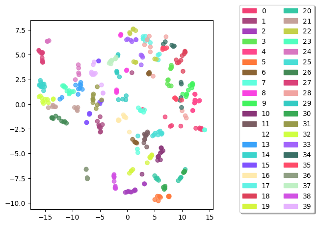
With t-SNE, most of the 40 people form their own tight clumps of color, much more cleanly than in the PCA scatter. Some people split into two or three clumps, perhaps photos with and without glasses, or under different lighting. With 40 random colors it can be hard to tell similar ones apart, so try re-running for a different coloring. The information to separate the people was in the 10 PCA dimensions all along; it just couldn’t be seen in a flat 2D projection. Keep in mind that t-SNE plots are for looking, not measuring: the distances between clusters, and the cluster sizes, don’t mean much, and the layout changes from run to run.